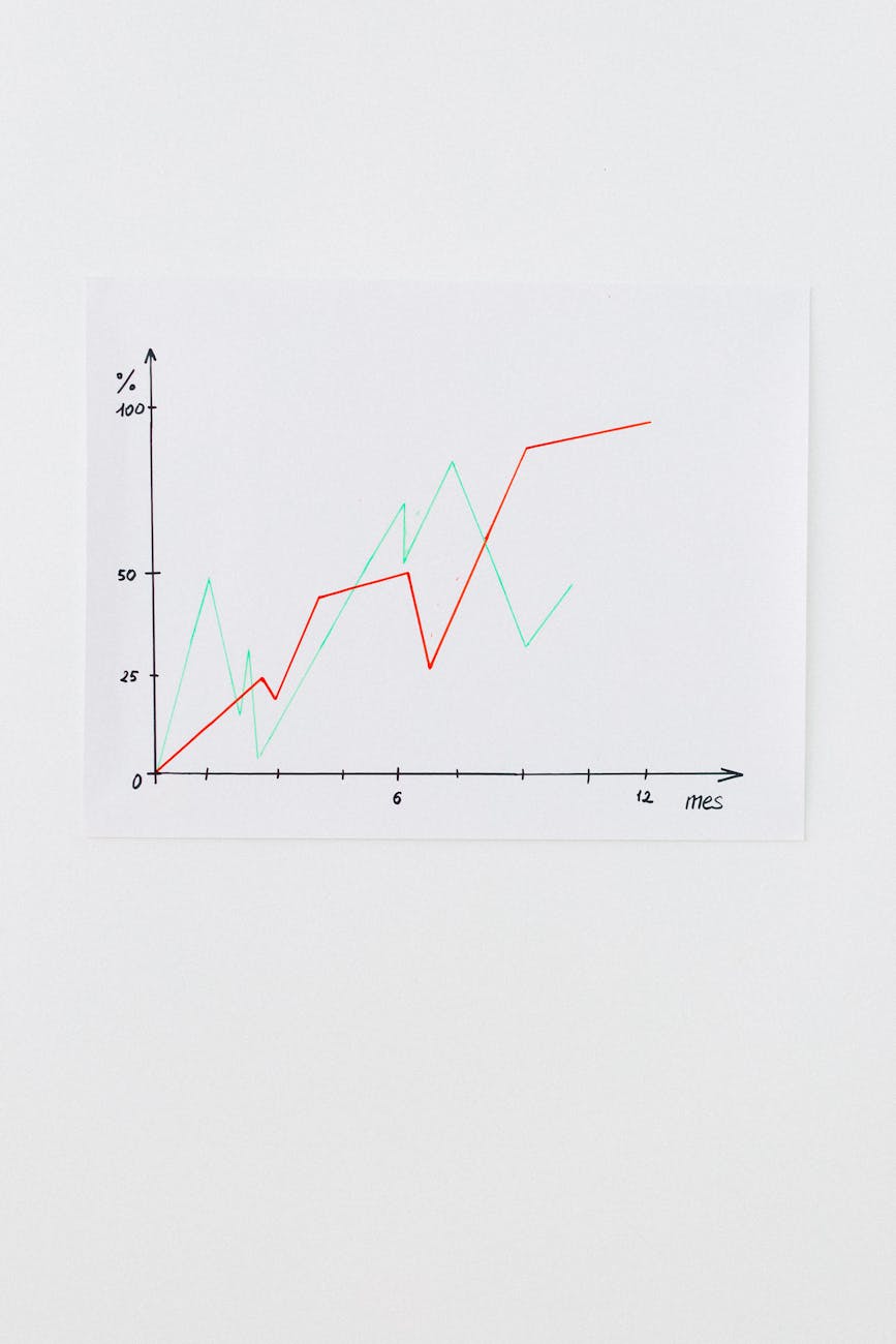
Heatmap reads that lead to simple wins for your website
Introduction. Heatmaps are visual guides that reveal where visitors click, scroll, and hover on a page. By interpreting these patterns, you can make targeted changes that boost engagement, conversion rates, and user satisfaction—often with minimal effort. This article walks through practical heatmap reads, explains why they matter, and offers actionable steps to turn insights into quick wins.
Identify high‑impact areas on the page
Start by locating clusters of clicks that indicate where users expect primary actions. If a call‑to‑action button is buried behind a long scroll, it may be missed entirely. Conversely, an unexpected hotspot—like an image link in an odd place—shows a new opportunity.
- Locate the most clicked section and verify it matches your intended goal.
- Check for stray clicks on decorative elements; these often signal confusion.
Measure scroll depth to gauge content relevance
Scroll heatmaps reveal how far visitors travel down a page. If the majority stop before reaching key information, consider shortening copy or adding a sticky summary that pulls them forward. Conversely, if users rarely scroll past the header, you may be overloading the top section.
| Item | What it is | Why it matters |
|---|---|---|
| Scroll depth % | Average scroll percentage of visitors | Shows content engagement and potential drop‑off points |
| Click‑through rate on CTA | Clicks on the primary action relative to page views | Direct indicator of conversion effectiveness |
| Hover time over form fields | Time users spend hovering before filling a field | Highlights friction or confusion in data entry |
Create a simple heatmap‑driven workflow
1. Capture data for at least one week to smooth out anomalies.
2. Review the top three hotspots and assess alignment with objectives.
3. Prioritize changes that affect the highest traffic area—usually the first 300 px of the page.
4. Implement a quick tweak (e.g., repositioning a button, adding a sticky headline).
5. Re‑measure to confirm impact before moving on.
Common pitfalls and how to avoid them
Heatmaps show where users act, not why they act. Relying solely on visual data can lead to misinterpretation. Combine heatmap insights with user testing or surveys for deeper context. Also, be wary of over‑optimizing minor clicks; focus on changes that influence key conversions.
Conclusion. Heatmaps are a low‑effort tool that can unlock significant performance gains when read correctly. By focusing on high‑impact areas, measuring scroll depth, and applying a clear workflow, you can convert visual data into tangible wins—improving user experience and driving conversions faster than you might think possible. Start with one simple tweak today and iterate for continuous improvement.
Image by: Nataliya Vaitkevich


