Empty states that drive action, not confusion
Introduction. When a user lands on an empty page—no products, no messages, no data—the first instinct is often frustration. Yet the right empty state can be a powerful catalyst for engagement. This article explores how to design empty states that guide users toward meaningful actions, increase conversion rates, and reduce bounce. We’ll cover practical principles, metrics, real‑world examples, and common pitfalls so you can turn those silent screens into active conversion tools.
Understanding the purpose of an empty state
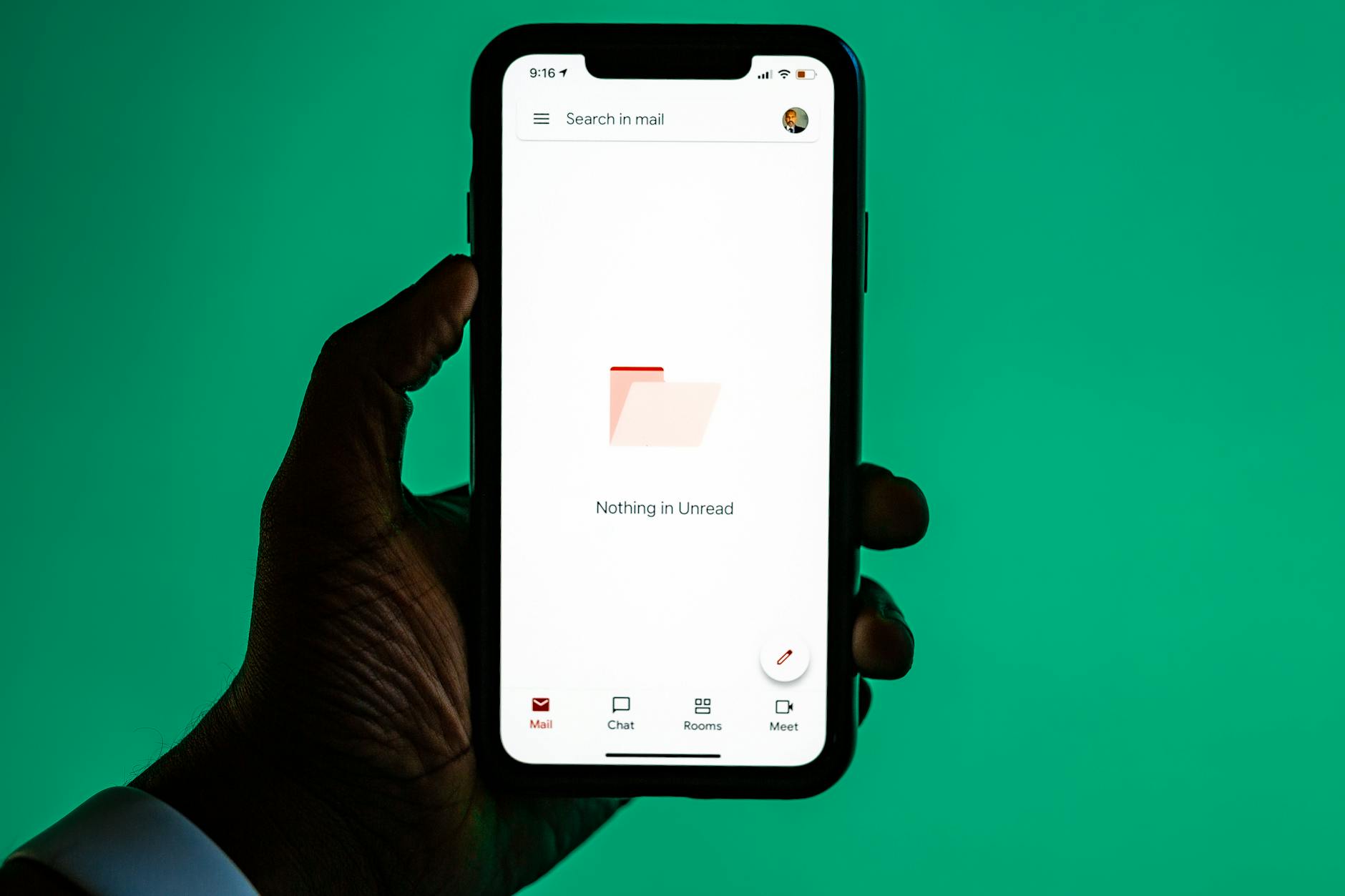
An empty state is not a blank canvas; it’s a strategic opportunity to communicate next steps. By framing what the user should do next, designers convert confusion into clarity and hesitation into movement. The goal is threefold: inform, motivate, and reduce cognitive load.
- Clear call‑to‑action reduces decision fatigue and boosts click‑throughs.
- Contextual messaging reassures users that the absence is intentional, not a bug.
Design principles for action‑oriented empty states
Successful empty states share common design traits: brevity, relevance, and a visible path forward. Measure success with time to first action and conversion rates after implementation.
| Item | What it is | Why it matters |
|---|---|---|
| Visual hierarchy | Primary message stands out with bold type and color. | Users locate the next step faster, lowering abandonment. |
| Actionable wording | Use verbs like “Add items” or “Start your journey.” | Clear language drives clicks and reduces hesitation. |
| Micro‑copy empathy | Acknowledge user frustration with a friendly tone. | Builds trust, encouraging users to explore further. |
Implementing an effective workflow: from design to deployment
Follow this streamlined process to create and test empty states that convert:
- Identify common empty scenarios (e.g., cart, search results).
- Create low‑fidelity sketches emphasizing headline, subtext, CTA.
- Run A/B tests with variations in tone and imagery.
- Track metrics: click‑through rate, time to action, conversion lift.
- Iterate based on data; refine wording or button placement as needed.
Avoiding the most common mistakes
Many teams fall into traps that dilute impact. Address these early to preserve the promise of clear guidance:
- Overloading with too many options—keep CTAs minimal.
- Using generic stock photos—opt for brand‑aligned visuals.
- Ignoring device differences—ensure mobile layouts maintain hierarchy.
Conclusion. Empty states are not a sign of failure; they’re an invitation to guide users toward value. By applying focused design principles, testing rigorously, and avoiding common missteps, you transform silent screens into action engines. Start by mapping your most frequent empty scenarios, prototype clear CTAs, and let data steer the final polish. Your next conversion spike may just be a well‑crafted message away.
Image by: Solen Feyissa